More specifically, spatial-temporal can be broken down into its two parts. Spatial refers to the location of the data point, generally defined by an ordered pair: (latitude, longitude). Temporal refers to the time at which the data point was collected, often in the form: yyyy-mm-ddThh:mm:ss.
For the purposes of these visualizations, please refer to the following terminology:
Spatially-Static and Temporally-Static Data → Static Data
Spatially-Static and Temporally-Dynamic Data → Time Series Data
Spatially-Dynamic and Temporally-Dynamic Data → Dynamic Data
Please note that datasets with the combination of spatially-dynamic and temporally-static are impossible to collect, as this type of data implies instantaneous change, which is not feasible for physical data sets.
These are the data sets we used and information about them.
Data Details
This type of data refers to fixed points in space. When applied to a map they reveal information about geographical distribution of some dataset. It can be described as both spatially-static and temporally-static.
These are the static data sets we used and some information describing the datasets.
- Streetlight Locations [Source]
- Boston provides information on the street lights in the city.
- Hubway Bike Share Rack Locations [Source]
- Boston provides information on the locations of their Hubway Bike Share bike rack locations.
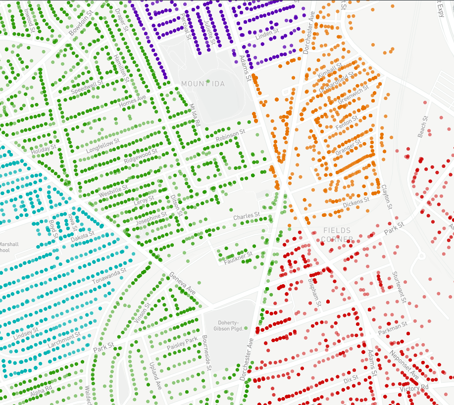
Contour Lines | Streetlights | Hubway Stations
Imagine a bike share program interested in creating new locations for their existing bike share network. In this example, consider the city wide Hubway Bike Share in Boston, MA. Using just three datasets and our mapping features, we are able to give recommendations on where and where not to place new Hubway bike stations.
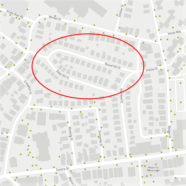
On Streetlights
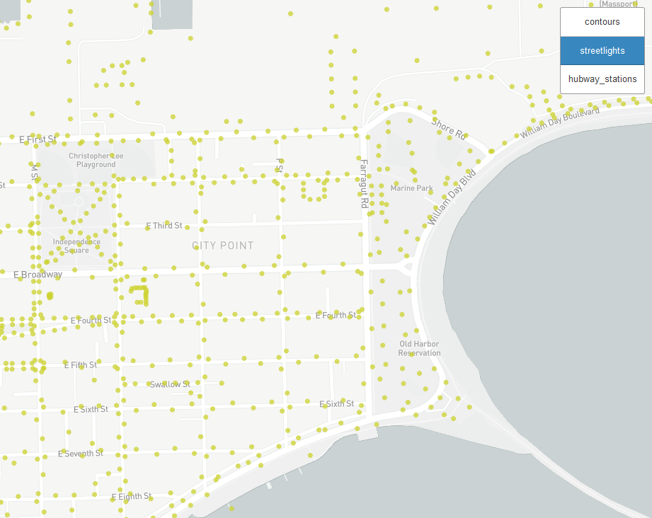
First consider the safety of a bike rider - new bike stations should be placed in a well-lit areas. Using a data set of all street lights in Boston, we are able to cross-reference areas that are more or less safe for new bike rental stations.
Using this view gives a high level view of the city. For a more useful application we could use this view to ask “Is this area a well-lit location for a new bike station?” For example, there are not any street lights in the neighborhood of Round Hill or Edge Hill street. The bike share manager may have thought this would be a successful location due to the high population of the residential area, however our urban data visualization shows that putting a bike station in that area may lead to decreased rider safety and increased bike theft under the veil of a dark night.
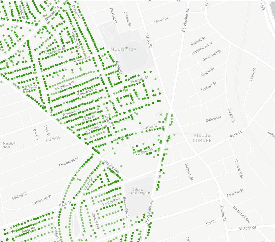
On Contour Lines
Next consider the users that will have to ride the bikes in their physical environment. One common problem that bike share programs have is that users will avoid areas with steep hills. By adding a contour layer we are able to get an idea about the environment and make decisions based on the elevation of the land.
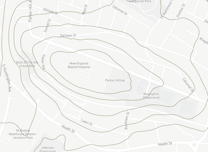
For example, consider adding a new bike station at New England Baptist Hospital. The bike share manager may initially think that a hospital would be a popular place for a new bike station; the hospital may promote healthy transportation and there are a lot of employees who might benefit from riding a bike to work. However, when considering the terrain, it is clear that New England Baptist Hospital is on a steep hill due to the frequent and closely packed contour lines. Using the contour data it the bike share manager realizes that the hospital is on too steep of a hill to make it a successful bike station.
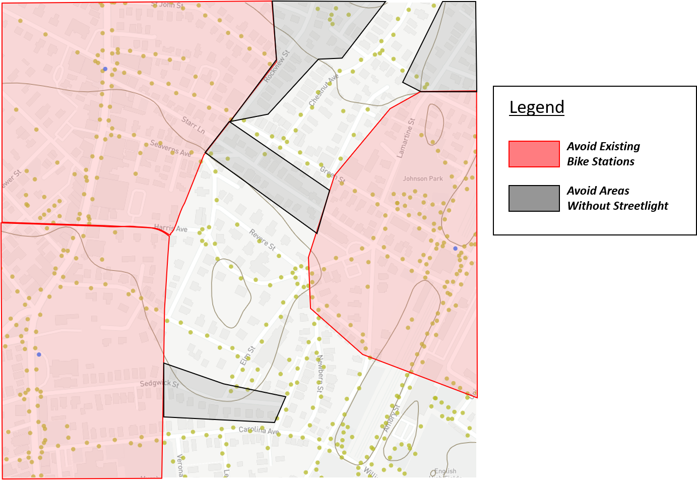
All Together
All of this data is useful individually but more powerful all together. By combining the three layers of data on one map we are able to show a more complete picture of the urban environment. Now the user can find the best location a new bike station, considering well lit areas and low elevations. Furthermore, they can ensure that the locations of bike stations are neither to close together - causing redundant stops - nor too far apart - causing long uncomfortable rides - from one another.
Data Details
This type of data shows the change in a particular location over time. This can refer to the change of a number of categories of data, often relating to the collection or redistribution of some entity at a location. It can be described as spatially-static and temporally-dynamic.
These are the time series data sets we used and some information describing the datasets.
- Recycling Schedule [Source]
- Recycling pickup occurs in specific locations in the city on a timely basis. Trash pickup can be used to observe traffic patterns and determine bottlenecks.
- Recycling Schedule - Monday
- Recycling Schedule - Tuesday
- Recycling Schedule - Wednesday
- Recycling Schedule - Thursday
- Recycling Schedule - Friday
Recycling Data (Monday - Friday)
Imaging a recycling company interested in understanding how their teams move throughout the city during the week. The company can use GPS locations to track each of the houses that their trucks visit during each day of the week. Using this data, they would be able to visualize the time series distribution of their resources on our website. In our example, we used existing recycling data recorded during each weekday. Five unique colors differentiate each day of the week. Within each day, each data point shows a location that was visited by the recycling company.
The recycling company can use this visualization to make some important discoveries. For example, imagine the company invests in a new truck and needs to consider which area to send that truck. They can use our system to view each day’s data one at a time in order to find the area in the city that has the most stops with relatively few trucks visiting those stops. By doing this sort of analysis, the recycling company is able to better distribute their trucks in order to maximize coverage in the city.
Furthermore, using our visualizations the recycling company is able to determine the best route for their trucks on any given day. Assuming that the company has a large fleet of trucks, the best option they have is to spread out their trucks throughout the city and have those trucks service large neighborhoods in one day of operation. By separating the trucks, the company is able to minimize the amount of traffic that they cause in the city. By servicing entire neighborhoods at a time, the company is able to alleviate the burden on a neighborhood by visiting the area only once.
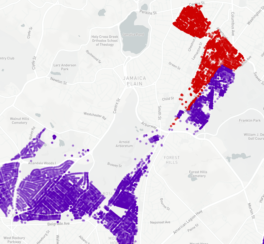
Using our visualization tools we are able to see one area in which this best practice is violated. Using the data from the Wednesday (purple) and Friday (red) datasets, we are able to see a situation in which the recycling company a) crosses the large Arborway highway unnecessarily because they b) fail to service the entire neighborhood on the east side of Washington Street. By simply visualizing this data we can recommend to the recycling company that they should consider servicing the Washington Street neighborhood entirely on Friday in order to both optimize their coverage in that area and alleviate any traffic congestion they may cause.
Our visualization tools also offer a “carousel” feature which separates the visualization for each day of the week and shows the days, one by on, for a short period of time. This feature allows the user to find patterns as their time series data evolves over time.
Data Details
This type of data shows how an object moves over time. By linking together many data points for a single object with unique time and location values,
it possible to view change over time. The most appropriate analogy for this behavior is how an object travels.
It can be described as both spatially-dynamic and temporally-dynamic.
These are the time series data sets we used and some information describing the datasets.
- NYC Green Taxi Pickup/Dropoff [Source] - One Week
- NYC Green Taxis provide pickup/dropoff information. This dynamic dataset can be used to create a time-interactive map of the taxis around the city.
NYC Green Taxi Cab Pickup/Dropoff

Imagine New York Green Taxi drivers, who are interested in maximizing their profits. To do so they need to understand their customers’ habits by knowing where and when to make pickups and dropoffs. Using just one week’s worth of pickup and dropoff location data we are able to make a few conclusions and suggestions for these taxi drivers.
Pickup Limitations
Pickup points are heavily concentrated closely outside of Manhattan island but can not be found on the island itself. This is due to the policies that the Green Taxi drivers must abide by. This practice is a disservice to an individual taxi driver. It means that the taxi cabs are not being utilized in one of the most inhabited locations in the city. It is well known that many people in the heart of New York City do not own cars, and therefore would benefit from taking a taxi from their home in the city to someplace outside of the city. If the Green Taxi company were able to renegotiate their policies by allowing its drivers to make pickups in the city, they could greatly increase their efficiency and profit.
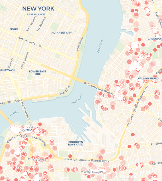
Dropoff Efficiencies
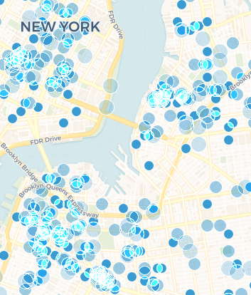
Dropoff points have a much more even distribution through the city, even finding their way onto Manhattan Island. This visualization helps us make our next recommendation to the taxi company; continuing under the restriction that Green Taxi drivers can not make pickups on Manhattan Island, drivers should be more efficient with their time by also restricting their dropoffs to outside of Manhattan Island. Doing so would increase the number of rides each taxi can complete by a factor of two because each off-island pickup would be followed by an off-island dropoff - and so on - without any intermission without a passenger in the cab.
Restricted Time
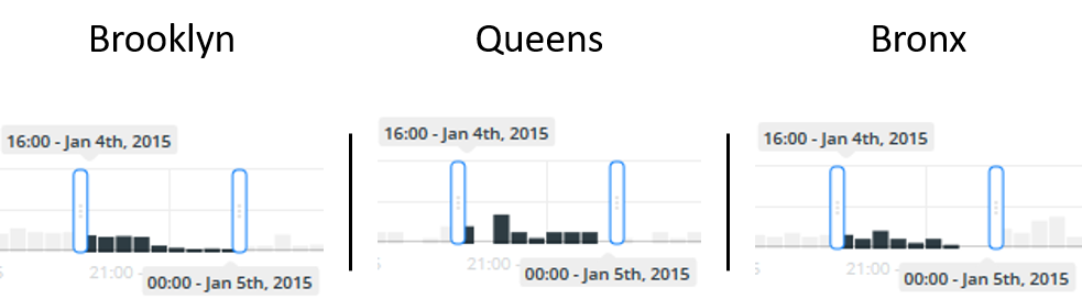
Now imagine a driver who shares the ownership of a particular Green Taxi cab and has no control over the time during which she can drive it. Her designated hours are from 4pm - 12am. Because she is able to decide where to drive the cab she is able to use our visualization to pick the most busy area to drive during her shift.
To complete this the driver would select the Pickup/Dropoff visualization and then identify three areas in which she may be interested in driving: for this example Brooklyn, Queens, and Bronx. Zooming into each area causes the visualization to display data points only within the bounding box of the display. With this the driver can discover that over one week there are 109, 17, and 36 pickups and dropoffs in Brooklyn, Queens, and Bronx respectively during her 4pm - 12pm shift. With this information, she is able to determine that her best chance at success is to spend her shift in Brooklyn.
Extensions
This example was created using only one week’s worth of data for one taxi company. Using a longer time frame for visualizing data would not only show daily/hourly patterns but could be used to show monthly/yearly patterns. Do passengers use taxis less in the summer months when the weather is nicer? Do passengers use taxis later in the summer months when it is brighter outside for longer? These questions can be answered by extending the time frame of the visualized dataset. Doing so would help the taxi company determine how many taxi drivers they need to hire during various parts of the year.
Comparing and contrasting data from two taxi companies would be useful as well. Do passengers prefer one company over another? Does each company have a portion of the city they frequent more often? Is one company better for longer trips while another is better for shorter trips? These are all questions that could be answered using our visualization. Doing so would help one company compete with another. They could make decisions based on the visualization to optimize their presence in the city.