A System for Massive Urban Data Visualization
With the increasingly widespread use of embedded sensor technology within cities, there is an abundance of spatiotemporal data. However, this data may not be useful without proper tools to visualize and analyze it. Thus, the purpose of this research project is to design a system to visualize this spatiotemporal urban data. The system, called Smart URban Visualization (SURV), is a framework built using HTML and CSS along with Mapbox.js and CARTO.js, JavaScript libraries that create interactive maps and dynamic visualizations. Python is also used within the system for its high-quality data processing. The utilities of websites have been proven in many visualization projects for its ability to provide interactivity to any built-in system. SURV provides a web interface where data animation and three-dimensional (3-D) visualization is built to provide the user a better data analysis.
SURV is a system that provides scalable and interactive data visualization. SURV handles big data by using the functionalities of Mapbox and Carto for rendering and databases, respectively. Also, Mapbox and Carto provide users with open source code which allow people to better interact with the data they are handling. With both Mapbox and Carto, modification in the open source code allows both massive urban data handling and provides the user with the dynamics of data visualization such as heatmaps, data animation and three-dimensional (3-D) urban modeling.
Data Animation
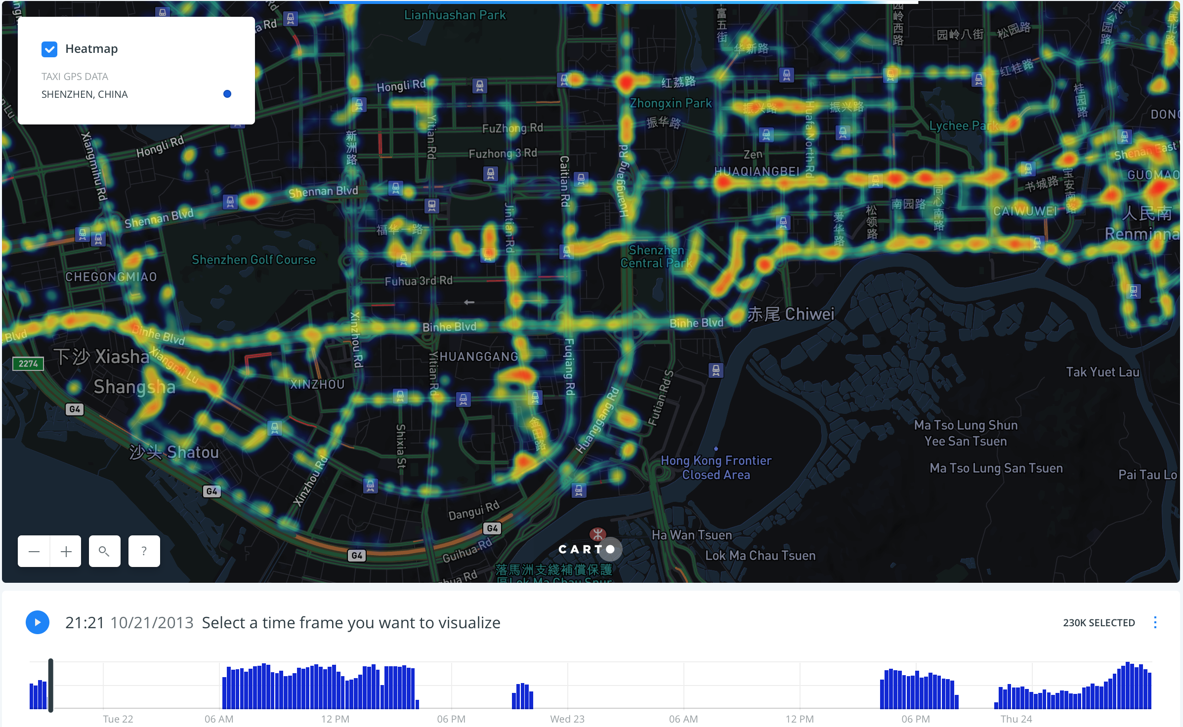
Heatmap Data Animation
the dataset runs a heatmap animation of a 3-day period which starts on Tuesday, October 23, 2013 and ends on Thursday, October 24, 2013.
The user can either observe the data animation as the time runs or select a specific time frame to view.
3-D Visualization
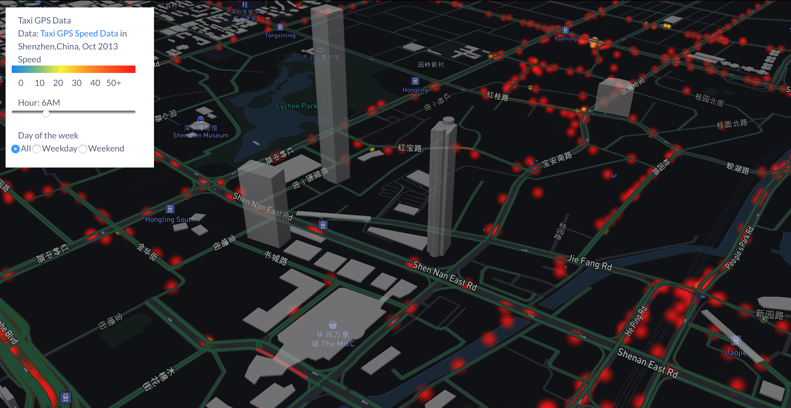
The addition of 3-D buildings allow the data to be better analyzed by observing where the set of points land on the map.
The addition of a time slider includes the “speed” property in the dataset of the GPS Taxi data. With the time slider the user can select the data at different time frames. The speed can be visualize by different colors in the dataset. For example, if the vehicle is driving at a speed between 0 - 10 mph, the dot color on the map will vary from blue to green and if the speed is 50+ mph, the dot color on the map will appear as red.
Data Upload
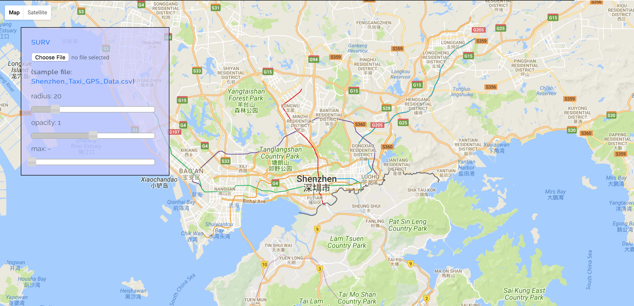
Further work on this project will include enhanced user interaction and analysis power. This includes the ability for the users to upload their own data.
The generalized nature of the system allows any spatial or spatiotemporal data to be rendered on the map, so the user may upload any type of location-based data
An additional goal would be to include an interface for statistical analysis of the spatial data
This research was funded by the National Science Foundation (NSF) through the REU SITE: Data science research for safe, sustainable, and healthy communities.